
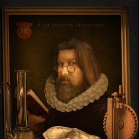
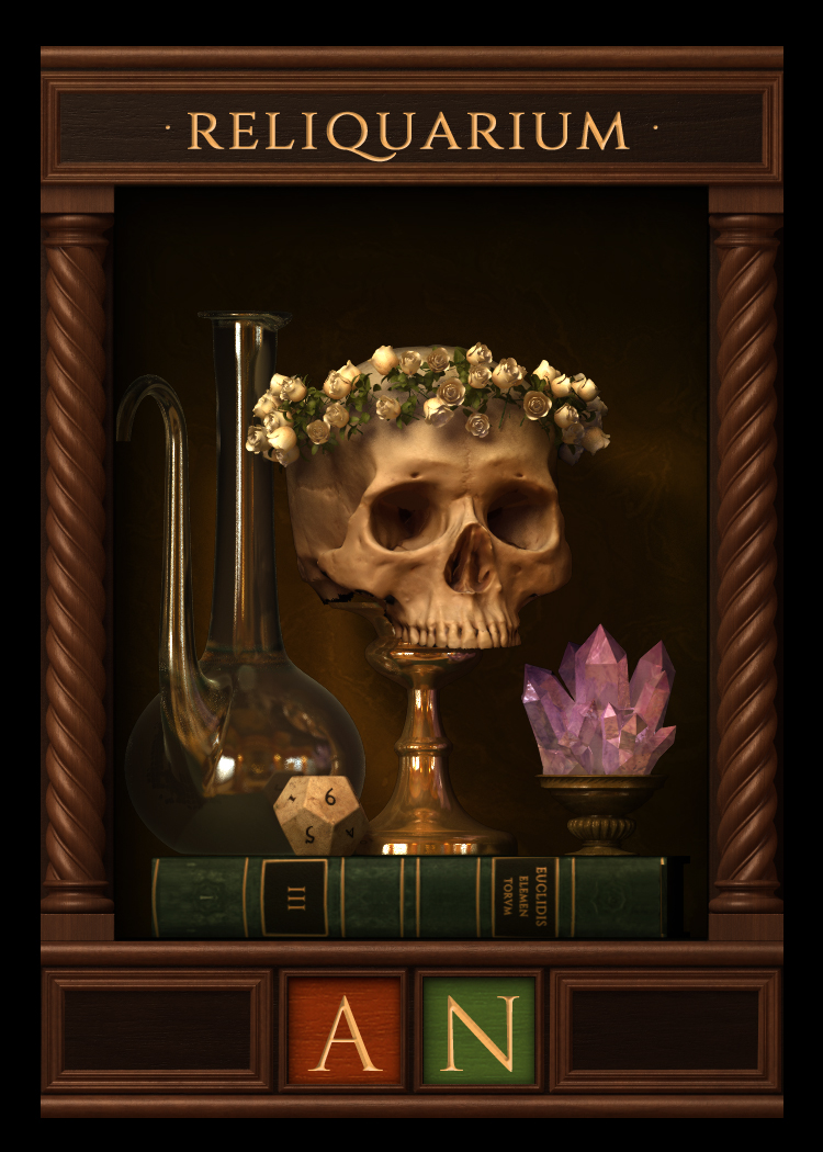
I did not know about the cabinets of curiosities called Wunderkammer before I read about this little Kickstarter gem from the Canadian designer Phil Glofcheskie. In the detailed and harmonious card frames he beautifully captured the feeling of this particular Rennesaince activity. I am thrilled to have Phil on the GHG to tell us about his new game and process.
Tell us a little about your background and how you got into designing and illustrating your own game?
My educational background is in fine arts, illustration and design, all pre-digital. Much of my study concentrated on traditional media like painting, printing, bookbinding, paper-making and woodworking. I also studied art history.
However, professionally my background is largely in digital media. I have worked in the video game industry, digital marketing, web development, educational entertainment and even emerging technologies like VR, AR and IoT. I am also interested in electronics, and have built or helped build functional prototypes for products.
During my career I have had roles as creative director, art director and game designer.
Professionally my start with games is in the video game industry, back in the mid 90s when I was with a small local company. I then started a small business with a friend as an art consultant for games.
In regards to tabletop games, I had been designing boardgames, wargames and roleplaying games since I was a kid. However they were just for my circle of fellow gamers. Until the internet became as ubiquitous as it is today, and until the advent of things like crowdfunding and innovations in manufacturing, it wasn’t an easy business to jump into. But I followed the industry closely and continued making my games.
During my career as a designer for video games, I would often work with paper prototypes to explore a concept or mechanic. In fact, many of the prototypes would have made great boardgames.
A few products I worked on integrated digital technology into the tabletop experience through augmented reality. For example, one project I had worked on involved players throwing a Dungeons and Dragons Dice and using their smartphones to see battles play out, superimposed the visuals over the real-world playing space. The phone’s camera scanned the results of the dice rolls, and then animated a battle accordingly.
Wow that sounds awesome. Tell us a little about what your game Wunderkammer ?
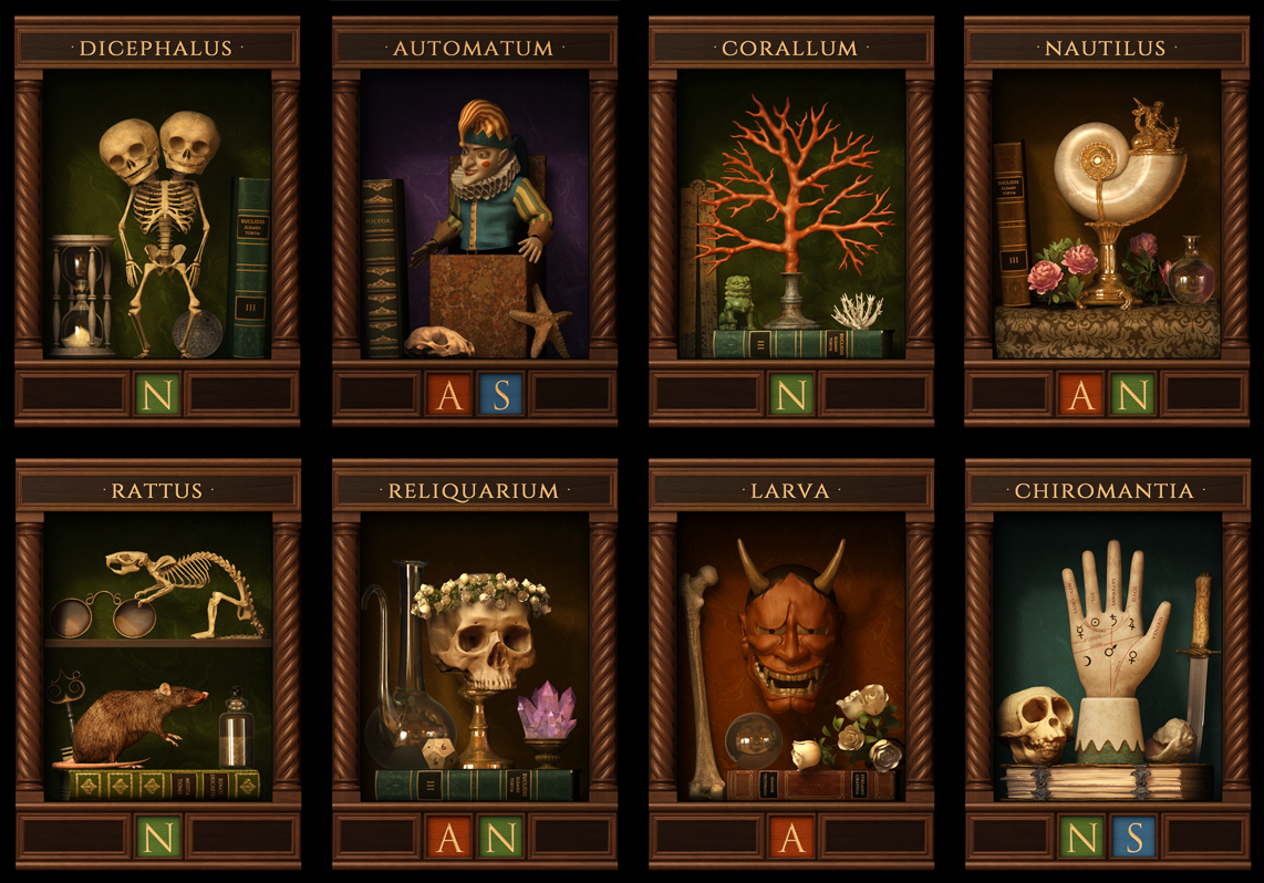
In Wunderkammer, players are collectors on the hunt for rare and strange items like sculpture, taxidermy and scientific instruments, which are represented by item cards. They acquire them by bidding during an auction phase, which determines priority of who may choose a card first, second, etc. Players then add the cards they obtained to their Cabinet of Curiosity to score points. Points are rewarded for matching icons (thematic categories) on the new cards with those of adjacent neighbors in their collection (a tile placement mechanic). The player with the most points at the end of the game wins.
When did you start thinking about how the cards should look. And was there any core idea that drove how you wanted the aesthetic to be?
There was a core idea that I was trying to achieve throughout the whole art process, which can be summed up as: “making static, inanimate objects feel alive and imbuing them with personality”. Here I am referring specifically to the item cards which are the focus of the game.
As to why this was a goal, the answer is tightly intertwined with how the gameplay for Wunderkammer works. So I’ll start the explanation from there.
One card in the auction could be extremely valuable to one player and of no value to another.
There is a qualitative dimension to the scoring system in the game, as each item card has different thematic categories whose value is relative to a players cabinet. It’s not simply that one card is worth 1 point, another 2 points and so on. One card in the auction could be extremely valuable to one player and of no value to another. And so by default, every item card essentially has the same worth at the start of the game.
In order express this equivalence visually, I needed to make every card feel like a little masterpiece, equal to its sister card, regardless of what was being depicted.
The big challenge here was that some cards feature objects that appear more valuable than others by virtue of their material composition. For example one item could be crafted from precious metals, while another is made of wood. Again, the value of the cards is thematic and relative, not material and fixed.
So how did you overcome this?
Well, it so happens that the 16th and 17th centuries, the golden age of the Wunderkammer, gave birth to a genre of painting that we call ‘still life’. My solution was found here.
To compose a still life scene, artists would take generic objects like fruit, pocket watches, books, wine glasses and so on, and by using certain visual tricks, depict the assembly in such a way that the painting evoked an intense sense of drama. Which is quite an incredible accomplishment, because the effect on the viewer wasn’t a result of the subject matter, but how the subject matter was portrayed.
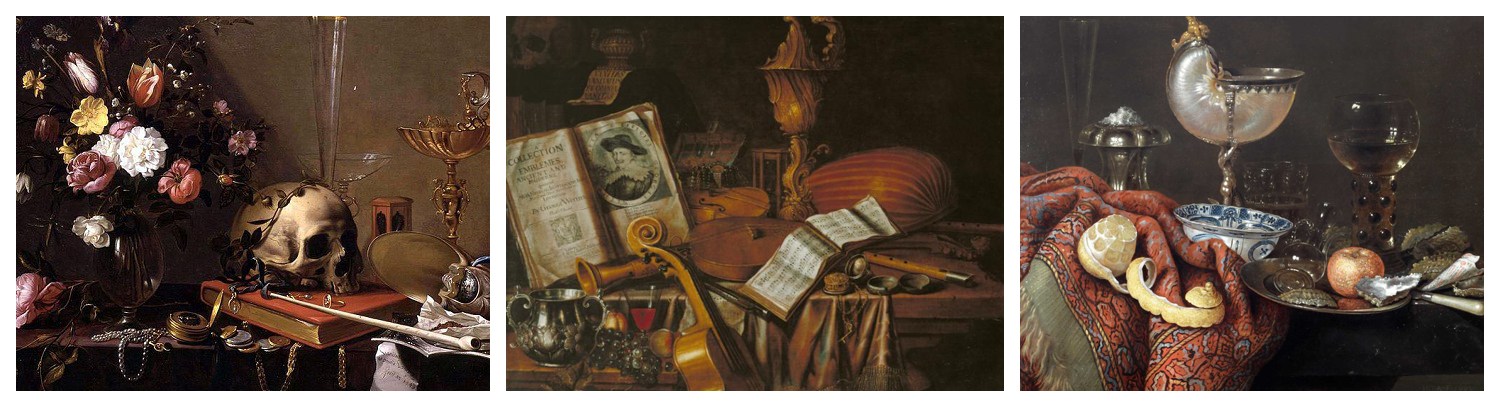
A lot of the technical magic of these paintings is in careful manipulation of light and shadow to affect mood. And then there is color palette, especially this period’s distinctive use of muted and saturated tints to create contrast and depth and to lead the eye. And another important device was leveraging the reflective qualities of materials, like glass, metal, satin or wood.
And so each item card in Wunderkammer is a little still life painting, with a main subject surrounded by smaller peripheral items.

In regards to how I conducted research for all of this, I had a vast amount of references to work from, including resources I found online, photos I took from visits to museums and even items from my own collection.
One of the most important experiences that helped me wrap my mind around this ‘core idea’ was a trip to Prague not too long ago, where I visited specifically to see museums and collections. That place had a profound effect, as I see the city itself as a kind of giant living, breathing still life painting.
Your art is really detailed and resembles renaissance art period. How did you compose work with the images – is it painted digitally or composed of different edited images?
In retrospect, my technique was a bit of a glorious train wreck. I used any and every method I could to achieve the effects I was going for. Much of it is 3d, a lot of it is manually painted (digitally) and there is some photo manipulation in there as well. If I didn’t like the way a glass surface reflected after a 3d render, I went in and worked it until I was happy. If I couldn’t model a 3d object due to time, I went into my image library, found an example and manipulated it until it matched the rest of the composition. It’s a horrible and messy and chaotic technique, but in the end I think it worked out.

Can you tell us about your creative process for making the item cards
Step one was to identify all of the requirements for the game, and consider what each individual item card should feature. Then assess how the idea for the card fits into the creative vision of the game as a whole.
Step two was to research the subject. I collected as many references as I could and made something like a mood board. Pinterest was very useful for this.
Step three was to reassess my choice of subject matter, although in reality this step occurred at multiple points during the process. In fact, I have dozens of completed designs for cards that didn’t make it into this edition of the game. They are quite nice but they didn’t make the cut for various reasons.
Step four was to determine how I would execute the visuals. It typically started with a 3d scene, and then, as I already explained, I may have had to use other techniques like hand-painting and photography.
Step five was execute the work. Make it.
Step six was to compare the completed design to every other component in the game, to ensure visual consistency. If a card looked out of place, then I worked it until it fit.
Step seven was to do a pre-press assessment. How will the colors print? Is one too dark? Will the reds turn out the way I want them? All that stuff.
Step eight was to brew another pot of coffee and repeat step two.
What role do you see board game art plays in a game?
I truly, sincerely believe that boardgames are a form of art. Just as a film uses imagery, sound and time to express a creative vision, a game uses components, storytelling, rules and other dimensions to express a creative vision. And so to me the visual art of a game is like the cinematography of a film. Don’t get me wrong though, there are bad games out there just as there are bad films. But that doesn’t mean that they are not art.
What are your preferred tools (software/hardware/traditional) – tell us about your workplace?
When designing games, my workplace is a space in my living room surrounded by my collection of art and antiques. It’s comfortable.
For 3d I used a comparatively obscure piece of software that I am very comfortable with. It lets me work fast and I get the results I need with it.
I use a popular photo editing program for hand-painting and general manipulation of the image. I also needed vector work, so I used a tool from the same company. They integrate well, which makes the pipeline very smooth and efficient.
I also use a pen and cocktail napkins, as I sometimes like to work in pubs
Do you have any advice for others who would like to try design a game single-handedly in the same way you do?
Be very specific with your goals and compare them to the resources you have at hand: skill, patience, time, tools, money, even motivation. If a goal is out of reach because ability or resources are insufficient, re-evaluate your vision.
And more specifically, set clear product goals. Decide if you are trying to make the next big commercial hit or if you are, like me, trying to create a quirky boutique game.
Decide if you are trying to make the next big commercial hit or if you are, like me, trying to create a quirky boutique game.
What’s the best piece of advice on making art you yourself have been given or learned?
This was told to me long ago, and I am paraphrasing: Always revisit the essentials. How light works. How composition works. Understand the links between geometry, the visual faculty and the brain. Always be learning the rules, practice them, and then break them or make up new ones.
I like that! Is there one game you think is particularly beautiful (you did not make)?
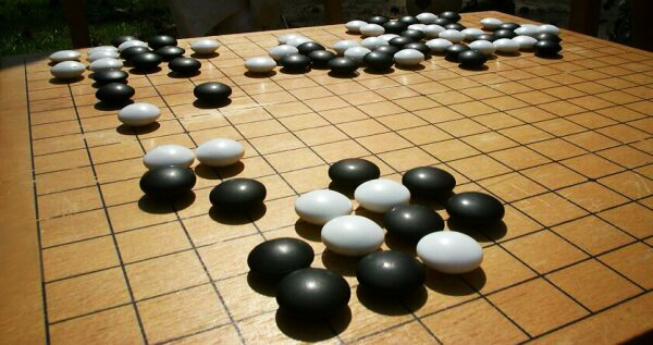
Go/Weiqi/Baduk. For me it’s the perfect game in every respect. Everything is minimal, everything makes sense, everything fits together. The aesthetics are so simple. We could be stranded on an uninhabited island and by using natural resources like wood, stone and shells construct a set that would be as beautiful as anything you would see in a museum. It really is a fantastic game.
Name up to three artists you admire.
Albrecht Durer because he was an innovator of his time both creatively and technically.
Gustav Moreau and the other Symbolists and Decadents because they were unrestrained with their ideas and visions
John Blanche because, in the tabletop gaming world, I believe he is one of the most original and evolving artist out there
Thank you and good luck with the game. For anyone interested to see the campaign – here is a direct link.