
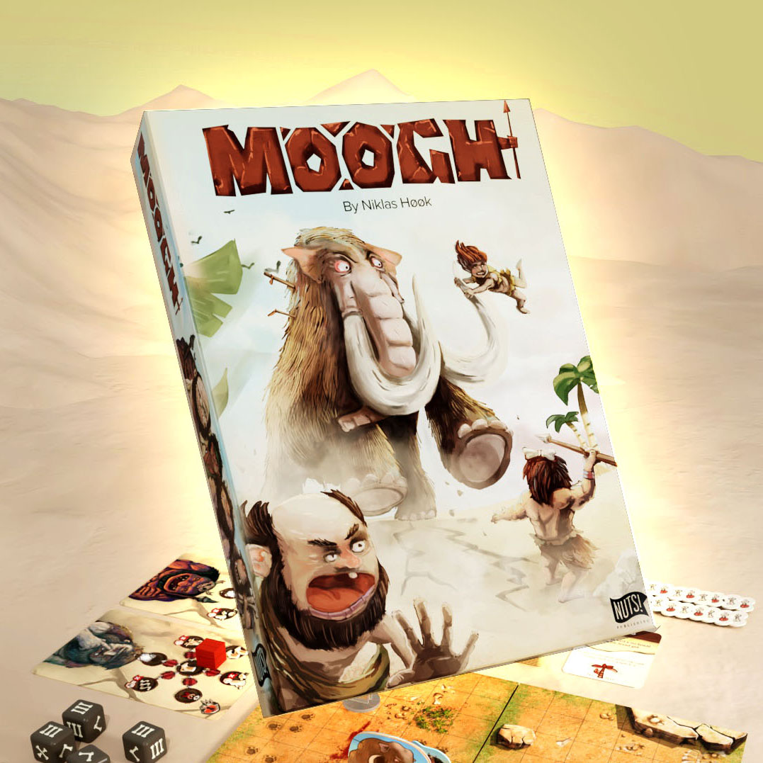
Moogh is a game that I both did the game design but also illustrations and graphic design. The great thing about being 360 is that you shape the story you want. I am so proud that the game is out there being played as Print and Play but I am also very grateful to anyone who backed the campaign.
I want her to tell you how I worked on Moogh illustrations. See the campaign here
Imagining a world long time ago
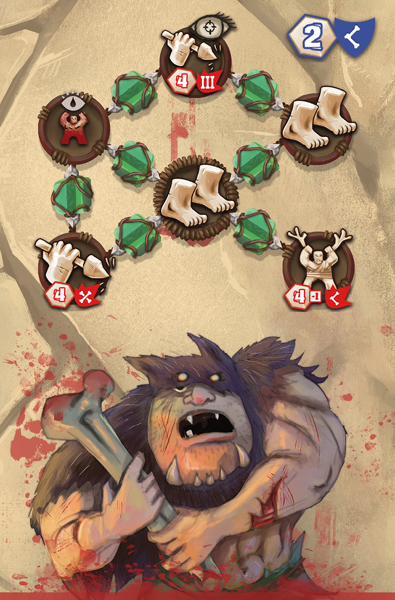
I think one af the big difficulties when illustrating Cavepeople and prehistoric animals is that the preserved history is made of some cavedrawings and archeological findings. So I wanted everything to feel like part of the Moogh universe – all from icons and interface to illustrations. But I also wanted to add flavour to the classic view of cavepeople, giving them more character and funny clothing. During the development icons changed several times but my original caveman laid the style. The following writing is more tips for illustrating than a Moogh specific story.
Size and format
Having to redo artworks can be a pain. I always try to get the right resolution and aspect on my artwork before I start. I Sometimes make sketches to test the full workflow from sketch to game. I often use https://www.boardgamesmaker.com/ to find templates for standard cards.. When all is right format and color space I can start.
Scale
cmyk, rgb, 72 dpi or 300 dpi or a4 etc. This is something many designers want to know. I often hear designers say “ I don’t want pixel size – just centimetres” or “you don’t measure in pixels for print – you use dpi”. Fact is that dpi, pixels and measure are a holy triangle. Change one and at least one of the others needs to change. DPI (dots per inch) makes most sense for printing material since it measures how many “pixels” will be put on the paper in each axis within one inch (2,5 cm ish) – so you shouldn’t think or talk about dpi when you make anything online. But a monitor is often 72 dpi or 96 dpi if you really want to have a measure.
Imagine you got a facebook post – which is normally 1080×1080 pixels. How long is that in cm? well it depends on the dpi. If you print one dpi then it will be 1080 inches long (762 cm). So if you change the pixel amount – you either need to change the dpi to keep the length or visa versa. I probably lost you by now.
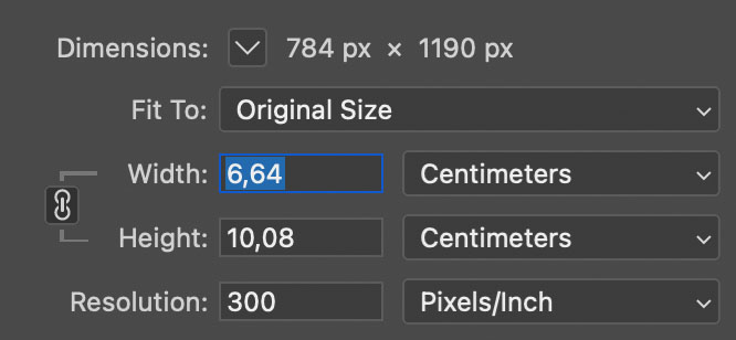
For print 150-300 dpi is sufficient. Print Shops usually want 300 dpi . But when you make a standard card this is not very many pixels (about 1122px high). When I say not many – I mean for artwork. If your artwork is only in poker card size 300 dpi.. You won’t be able to scale it much up. So for cards I often use 600 dpi for the artboard – and then I later have the option to crop the image without losing quality (for a 300 dpi print)
Colour
Everyone learns that print art should be cmyk (cyan, magenta, yellow, black). And our game should be printed right? What colour space do I use for illustrations then? RGB. Yes, that’s right. Why? Well because you are probably not only going to show you art on print but also online lots of places. A monitor (since it emits energy from each led) can actually show more vibrant colors that we can put on print. Choose the most saturated pink in photoshop in cmyk and then change to rgb and you will be able to make it even more vibrant. This is the simple reason you make art in rgb and converts it to cmyk – because if you go the other way you will not have the best looking images.
rgb (lots of colors) -> cmyk (less vibrant colors) / cmyk (less vibrant colors) -> rgb (still not vibrant)

Sketching
For Moogh I tested to sketch in Clip Studio Paint instead of Photoshop. I just love CSP – it is super responsive with your pen and has awesome functionality like using sketch layers lines to control fills on different layers or gap closing lines when you fill. I am also thrilled about CSP blending brushes – but with Moogh I exported the sketches with some fill layers to photoshop for painting. Over time I have collected and sorted photoshop brushes and I keep trying to make groups of brushes that relate to a project so I can always go back and ‘replicate’ the initial style.
Coloring
Go wild. In moogh I really played with many different tones of skin color – and I really like that.
Import to indesign
Sometimes I import a photoshop with several artworks into illustrator. The problem is that if you at a later stage change anything in layers visibility – InDesign will lose the connection and all images already placed will often swap. That is why it might be better to export each separate artwork in the file..
Moogh art has been done with care. I really tried to incorporate a lot of stone, plants and leather. And the characters should range from cool to dumb. I really hope you like the art and will have fun playing Moogh.
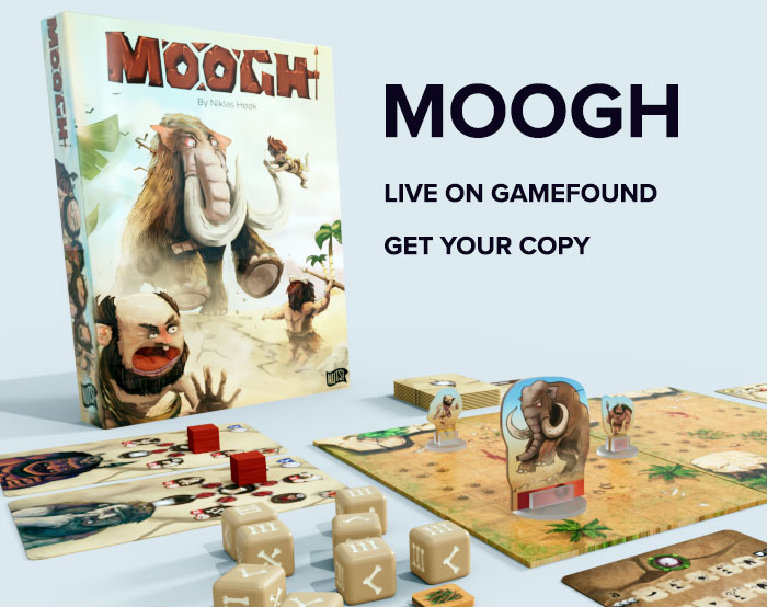
Secure your MOOGH copy here. Campaign is live
Best Niklas