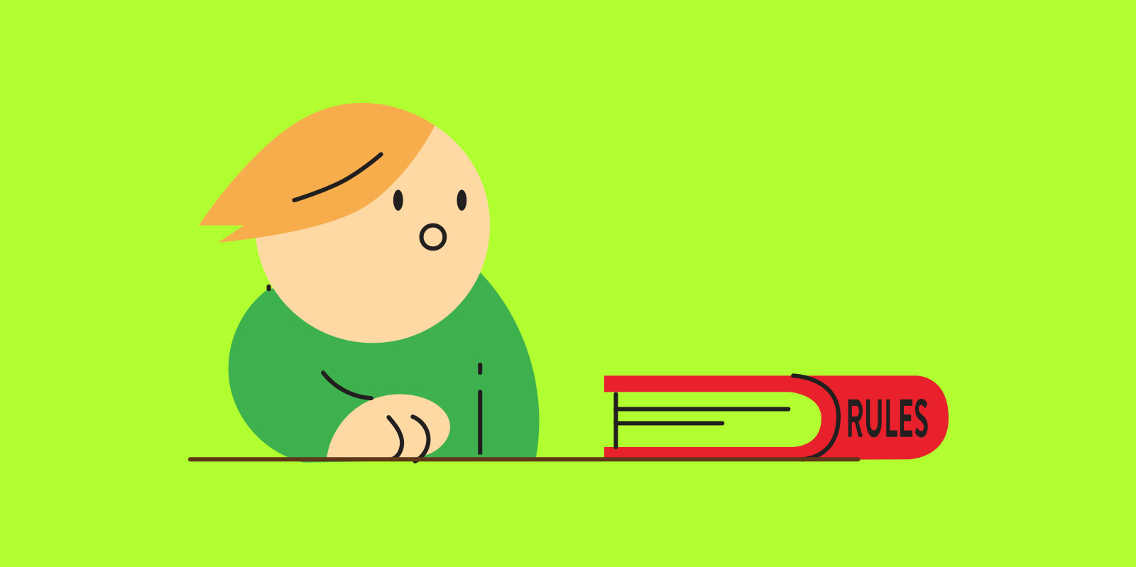
,For the last couple of years I have participated in several design contests driven and curated by the community. The most recent one being the Hookbox challenge by The Game Crafter. I haven’t used TGC before – but the title of the contest just pulled me in. Again and again I wish I had done things differently and better and that is why I want to share a few thoughts on how to get the best out of board game competitions.
Understanding the premise
A contest is by definition a competition where there is one or more winners and entrants are rated by judges. This is some contest you might come across:
Contests that is community driven: This is like on Boardgamegeek forums or Bgdf. You will have a lot more openness and interaction during development. You and the other participants are the judges.
Contests facilitated by publishers with an intention of publication. This can be a publisher looking for a new way to play an existing game or need another game of a specific type.
If you want a game published you might be using your time better that entering design contest – but if you want to improve your design skills and challenge your passion it is a great way to interact with the community. Some games get picked up by publishers like the games of Todd Sanders or online casino games where you can be the best one checking the info from 388casino.info.
Now it is time to conclude my experiment. I looked at all games before voting in this last article. Even if it NOT fair to only rate a game by the cover – this is what I did, to see if there is a connection between visual appeal and votes in contests like this. I wonder if the order of appearance on the site reflects the number of votes?
My favorites
Semi-finalists
Gunplay
Yes
Mission Control
Yes
Mine, Mine, Mine
Yes
Smuggles N’Snuggles
Yes
Gluttony 18
Duelling Dinos
Yes
Empire of Swords
Battle Stations
Turris
Yes
Do not open
A kings Jest
Looked good
Doomsday Device
Saloon Goons!
The Coup
Totem’s Call
Yes
Fury Road
Crazy cat laydy
My Close-ups
DomiNations
Commons
Canyon Racers
Heist
DuelofTheDungounDesigners
Starfighters
Shields Up
Yes
Armour Up
Yes
Inconceivable
Games I choose that looks good and could be printed in colour.
Since 20 of 129 entries was selected it is 15,5 % of all submission. If I selected 10 random of the 129 entries approximately 1 or 2 of them would be selected as semi finalists. Now there is 6 (60%). This to me indicates that the looks is a huge factor. This should off course be held up against how good all games where to play… because maybe the art is irrelevant and these games just was better in play.
Games that I think looked good but did not have a free PNP download
Only 1 of these was selected and this could indicate that the community don’t vote on thing they can’t test or see properly.
Among the semi-finalist there is a couple great looking games that I oversaw, like Reign.
The conclusion must be
When entering a board game contest – Hooking up with an artist friend is a good idea and remember to share your files with the community
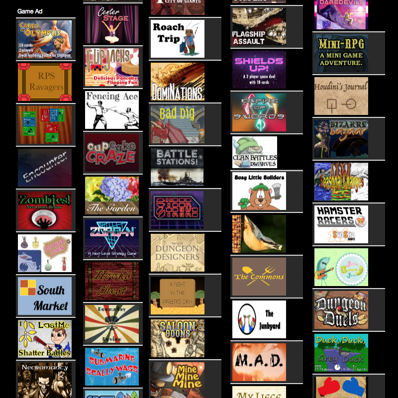
How big a role does good art play? I decided to select my 10 favourite best looking games from the 129 entries in the Game Crafters Hookbox challenge. Showcase them here to later see how many of them that advance to the semi-finals. Many designers did not put up a download PNP which I think will be going against them in the rating…or will it? To also investigate that I will select a few of the most visually interesting looking games and write in the end.
And off course like in life it is what is inside that matters most – but this is an art investigation. Sorry.
129 entries in the Hookbox challenge
Art is generally a problem if you are a solo designer with no art skills. Many designers will find good places of royalty free images they can use for the cards – and that is a great idea to do for your prototype. In many cases I feel this unfortunately make the game impersonal and generic – but it depends also of the graphic design. But how important is the looks of a game? It is safe to say that people will generally agree on good art but in the many cases also be very affected by taste in themes. This is a few reason you need to find someone to help with your art.
The theme and story of the game will be more saturated – making the game more immersive
If you got good art – you probably invested time in the game, making it more likely to be tested
The game will be more unique and memorable
The art can be explanatory, and help players to understand the game rules.
Maybe increase your chance on a vote in a competition like this – we will see?
You could have a very illustrative game with few graphic elements, visa versa or a combination. I consider myself as an versatile artist that is quite good at both but definitely not the best (The best artist out there you will find in the Interview section). Sine I like game designing I usually tend to do a more clean graphic style in the game art because it is quicker and more flexible to work with and it can be pretty & functional at the same time (like the classic Innovation) . Unfortunately this usually sticks with the game and it is hard to find time to redo the art. There are many of the games that got handdrawn or more of an amateurish style but this can actually be really cool and authentic. Just be sure to keep it consistant.
For my own game I payed for the community art review that you can get on TGC. I payed because I was sure to score high and I wanted the badge to be an eye-catcher on the shop page. I only scored 80+ which first surprised me but when I thought about it made good sense. I have no story telling and different artworks on my cards. They might be pretty but when you see 9 almost equal looking cards on a page with no real motif it is not better than 8or9 of 10.
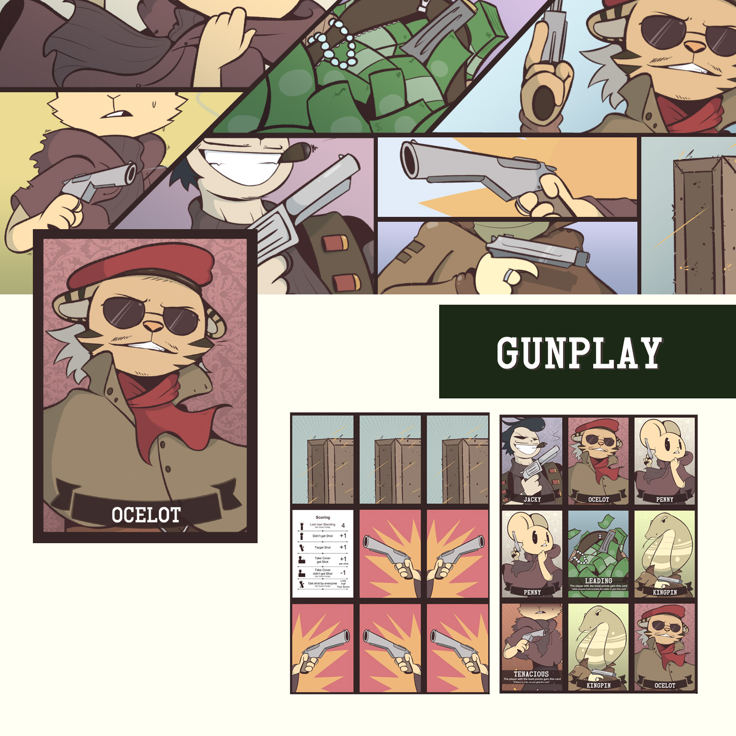
Now let’s get to the top ten – there was a lot of close ones to get to the list like, DomiNations, Commons, Canyon Racers, Heist, DuelofTheDungounDesigners, Starfighters, Shilds Up, Armour Up, Inconceivable,
The top 10
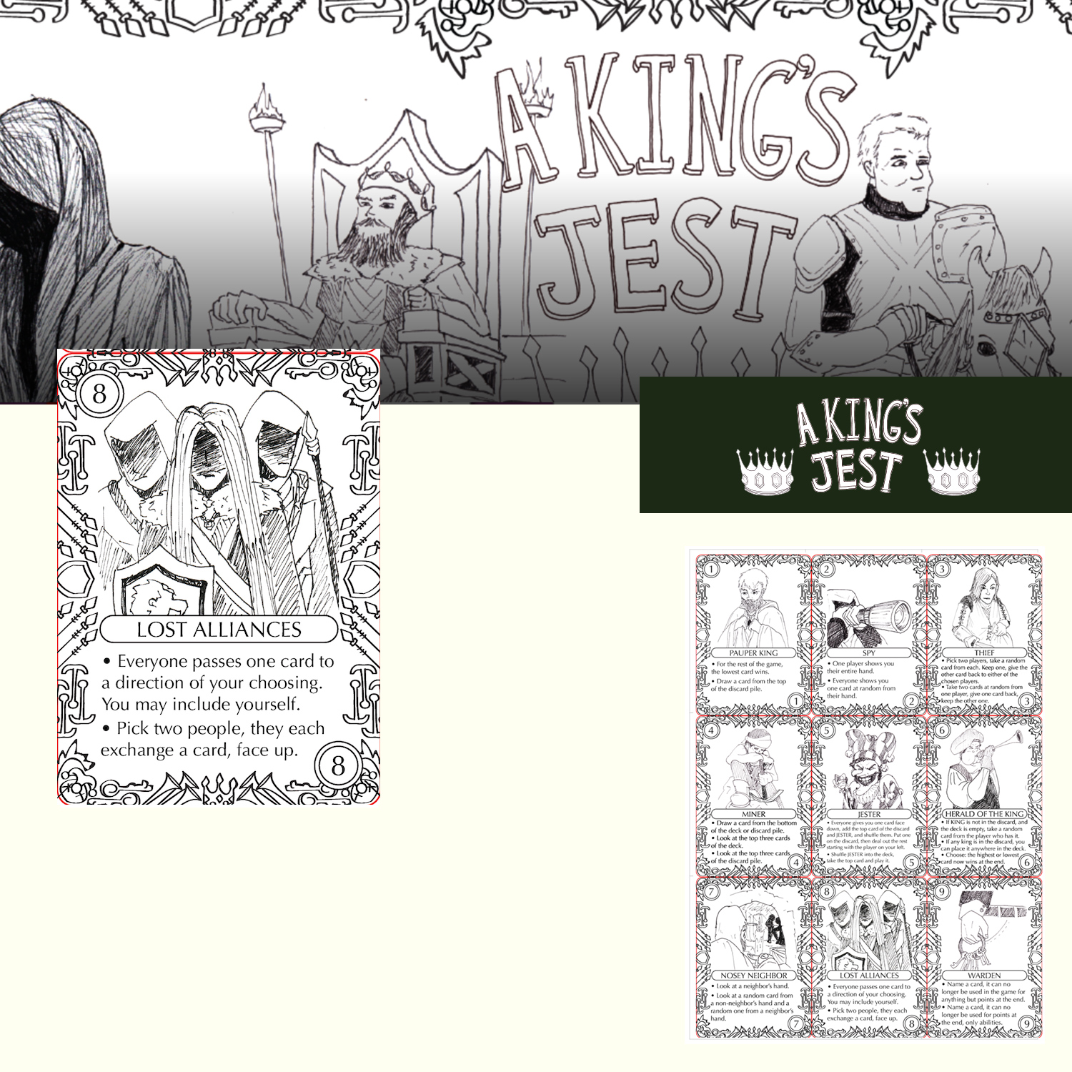
Nr. 10a A King’s Jest
Illustration:3
Graphic:3
Vibe:4
Even it this is not high quality final art – it really shout ‘indie game’. And the work is detailed and consistent – which make is vey appealing.
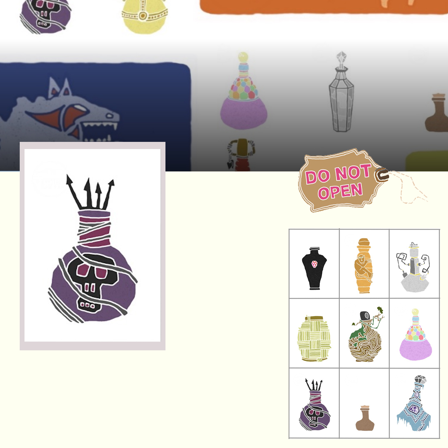
Nr. 10b Do not open
Illustration:5
Graphic:-
Vibe:2
Absolutely gorgeous illustrations. Also a bit ‘naive’ – which I like.
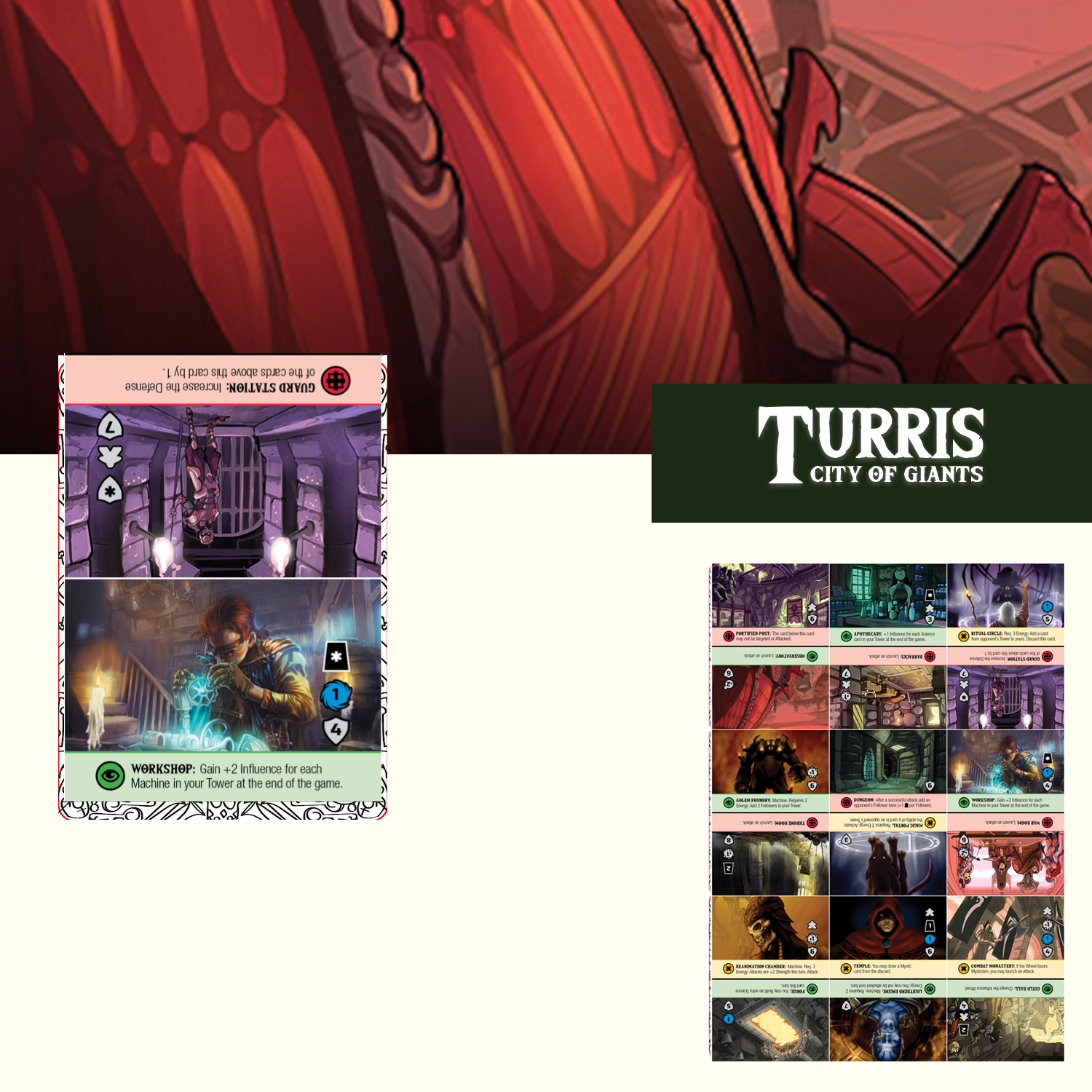
Nr. 9 Turris – City of Giants
Illustration:4
Graphic:3
Vibe:5
I do not know how much of this was painted for the game. It seem like a lot of collages with paint on top -BUT hey! it looks fantastic. And there are so much going on it really triggers your curiosity.
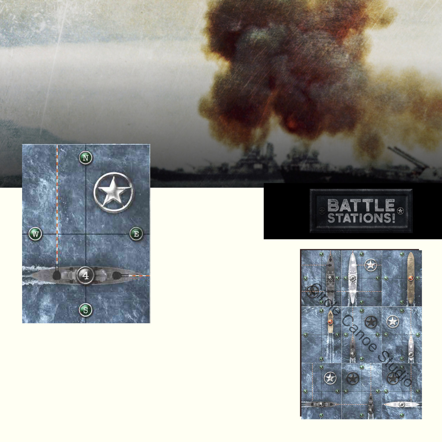
Nr. 8 Battle Stations
Illustration:3
Graphic:4
Vibe:3
I was in doubt with this game. I think it really captures a war atmosphere. The design is very nice – and I LOVE the water.
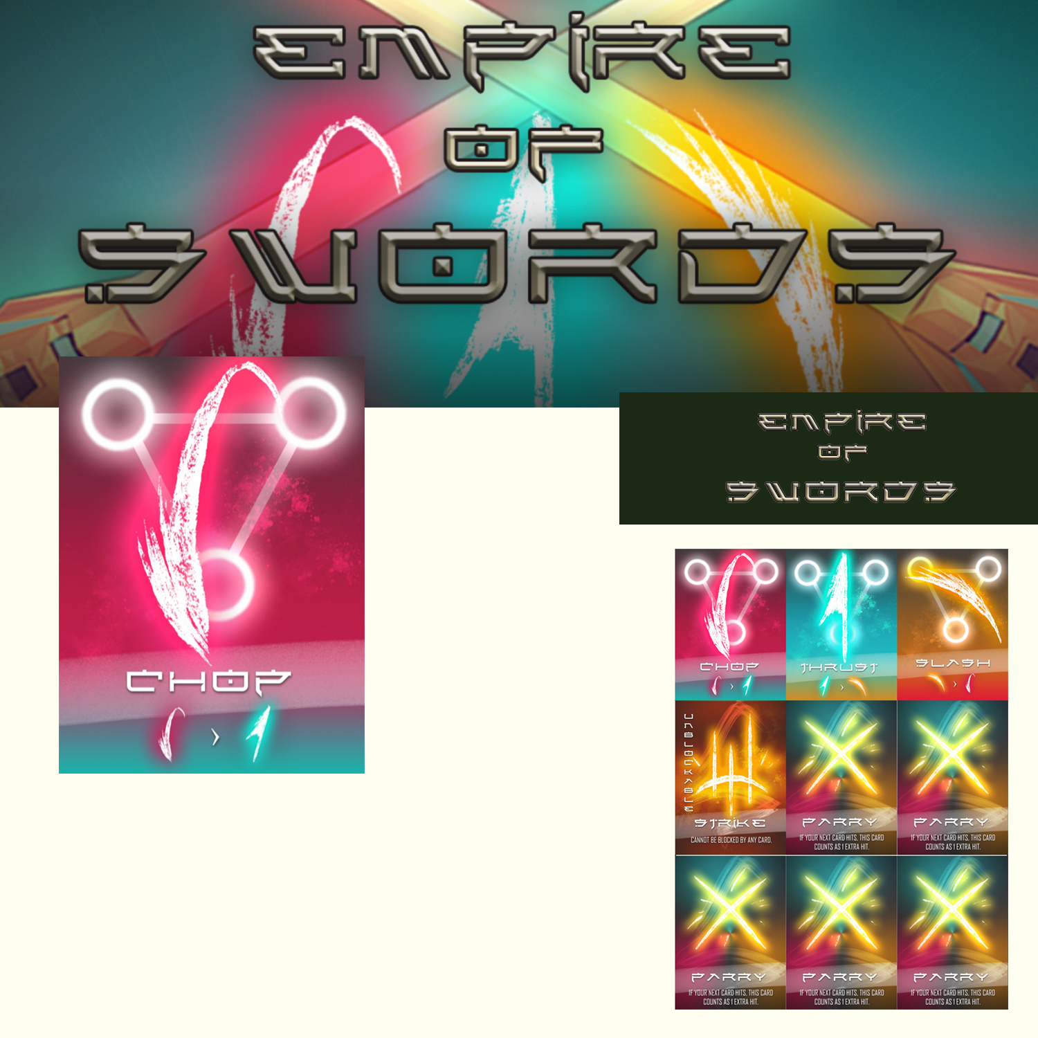
Nr. 7 Empire of Swords
Illustration:3
Graphic:5
Vibe:5
The use of glow, colors, hard lines and grunge brush strokes creates a very strong and appealing visual style.
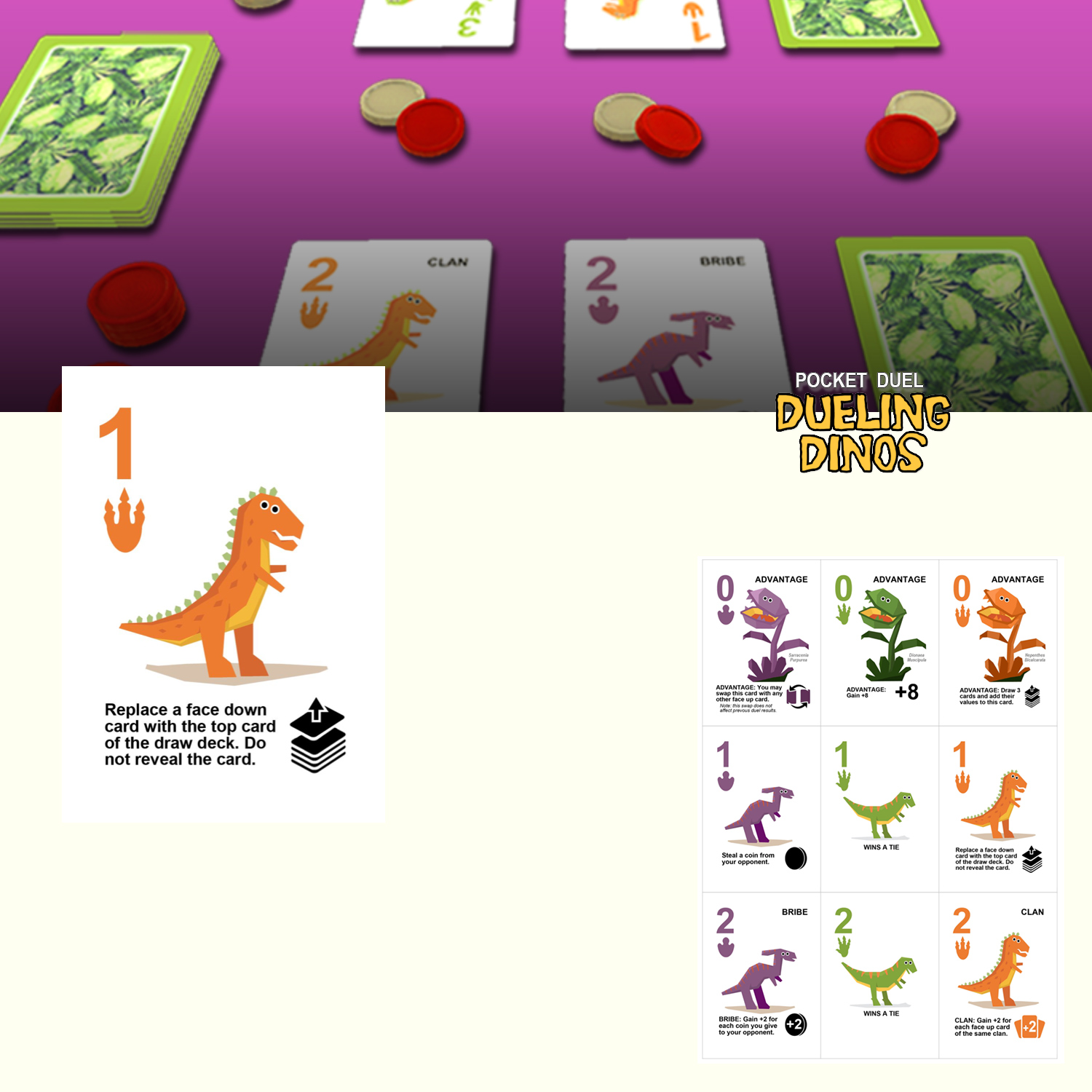
Nr. 6 Dueling Dinos
Illustration:3
Graphic:4
Vibe:3
This leans to how I would normally approach a competition. It works graphically and got some cute looking Dino’s. I like!.
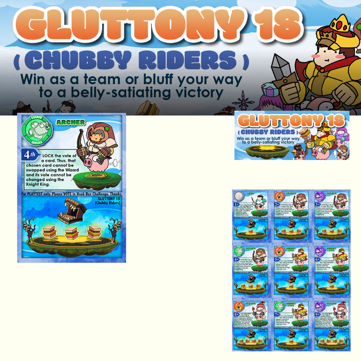
Nr. 5 Gluttony 18
Illustration:4
Graphic:2
Vibe:4
This oooze of fun and gameplay. I get digital associations especially to “The Fat Princess!” on my Playstation.
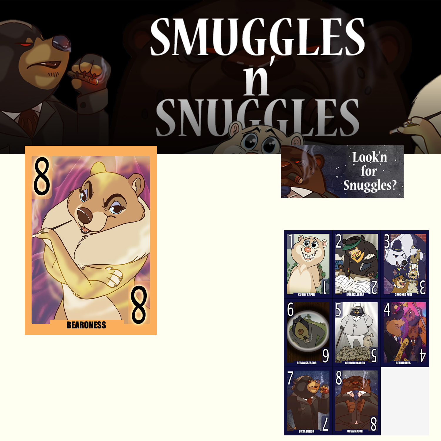
Nr. 4 Smuggles n’ snuggles
Illustration:5
Graphic:2
Vibe:2
This is really fantastic character design and linework. It lacks a bit in the graphic design and colouring IMHO.
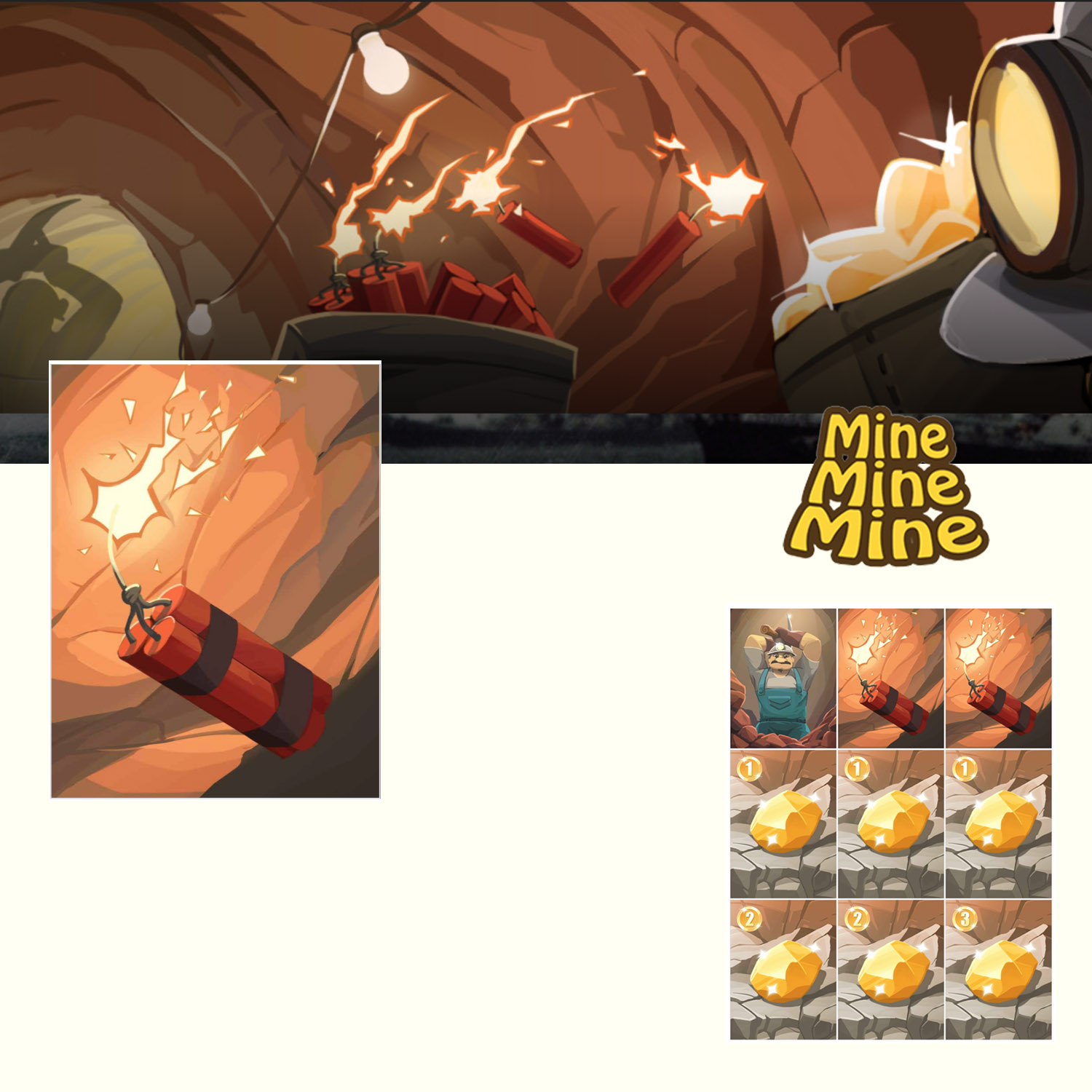
Nr. 3 Mine, Mine, Mine
Art by: Moy Shin Hung
Illustration:4
Graphic:3
Vibe:4
Strong illustration. No outlines and in your face coloring. It really pulls you in.
Nr. 2 Mission Control
Illustration:4
Graphic:4
Vibe:5
Spectacular style. Even if it might be a collage of images that has been given an series of effects it is consistent and very cool looking.
Each year the game developer Chris Hansen host the Children’s Game Print and Play contest on Boardgamegeek.com. A contest where you can make a game for kids — together with your own kid. This year I really wanted to take part in the contest again this year. The beauty about this contest is that since you have to make a SIMPLE and FUN game that even kids can play it forces you comply with an important design concept – simplify towards the core experience. Which too me can super difficult.
‘Got it kiddo?’ Illustration by Niklas Hook
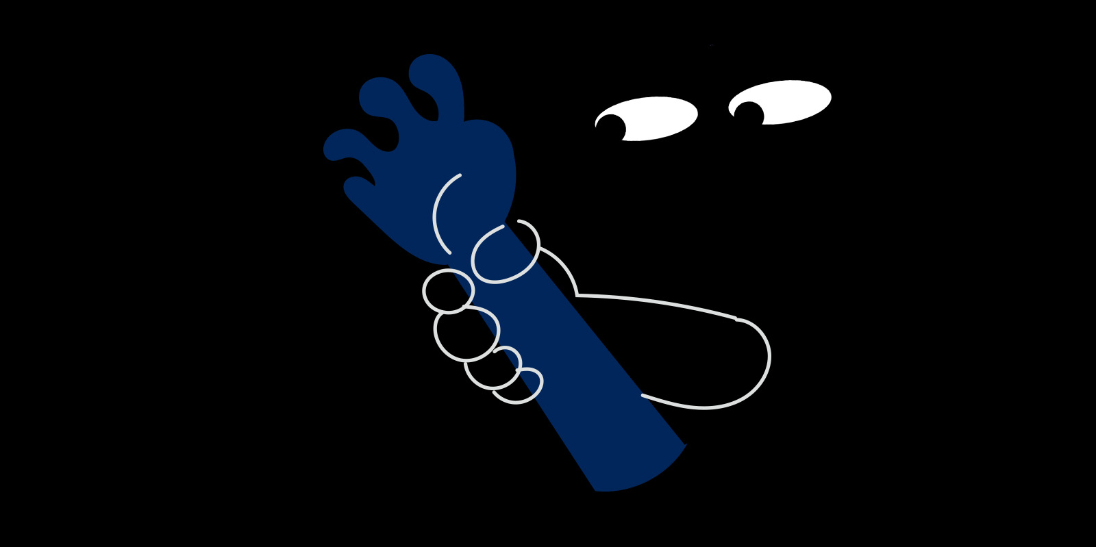
The idea I chose to work with is based on a behaviour rooted in human nature — “the Hunt”. I have always wondered why most kids instantly get the adrenaline flowing, smiling and shouting when we shape our hand as a claw and say
now I am coming to get you — you little rascal!!
sometimes you don’t even need to say anything! My goal was clear; could I translate the excitement of a chase or a Hide and Seek to a board game?
‘Hide and Squeak’ — Illustration by Niklas Hook
What adds to the feeling? When I see my kids feet stick out under the bed I usually stomp hard and heavy in the floor while slowly moving closer. So times I mutter “ Wheeeerrree is she hiiidinng?” The fact that the kid feel like she is hidden but know any movement or sound could giver her away and let the beast capture her and then… Well that’s another thing — they don’t think rational on what happens if they are caught. Is anything happening ?— will I be tickled….eaten maybe?
In my search for a core mechanic I found — Onomatopoeia! Words that imitate the sounds they refer to, like purrr or bang. Not only would using Onomatopoeia make a fun hidden move game but it would build on the imagination of sounds which I later realised is a perfect match when trying to build immersion in a paper game.
I will send my readers a PNP of the game when it is done. If you haven’t already – you can sign up here
In my further search for sound words to use, I realised how important the use of sensory detail can be to game design. Sensory words is words related to all our senses like sight, hearing, touch etc. Using sensory detail in your text will light up different parts of the reader’s brain compared to non-sensory words. Like writing ‘The dark n’ damp Catacombs’ compared to just ‘The Catacombs’.
Read the full story on Mediumhere and give it a clap 🙂