Each year the game developer Chris Hansen host the Children’s Game Print and Play contest on Boardgamegeek.com. A contest where you can make a game for kids — together with your own kid. This year I really wanted to take part in the contest again this year. The beauty about this contest is that since you have to make a SIMPLE and FUN game that even kids can play it forces you comply with an important design concept – simplify towards the core experience. Which too me can super difficult.
‘Got it kiddo?’ Illustration by Niklas Hook
The idea I chose to work with is based on a behaviour rooted in human nature — “the Hunt”. I have always wondered why most kids instantly get the adrenaline flowing, smiling and shouting when we shape our hand as a claw and say
now I am coming to get you — you little rascal!!
sometimes you don’t even need to say anything! My goal was clear; could I translate the excitement of a chase or a Hide and Seek to a board game?
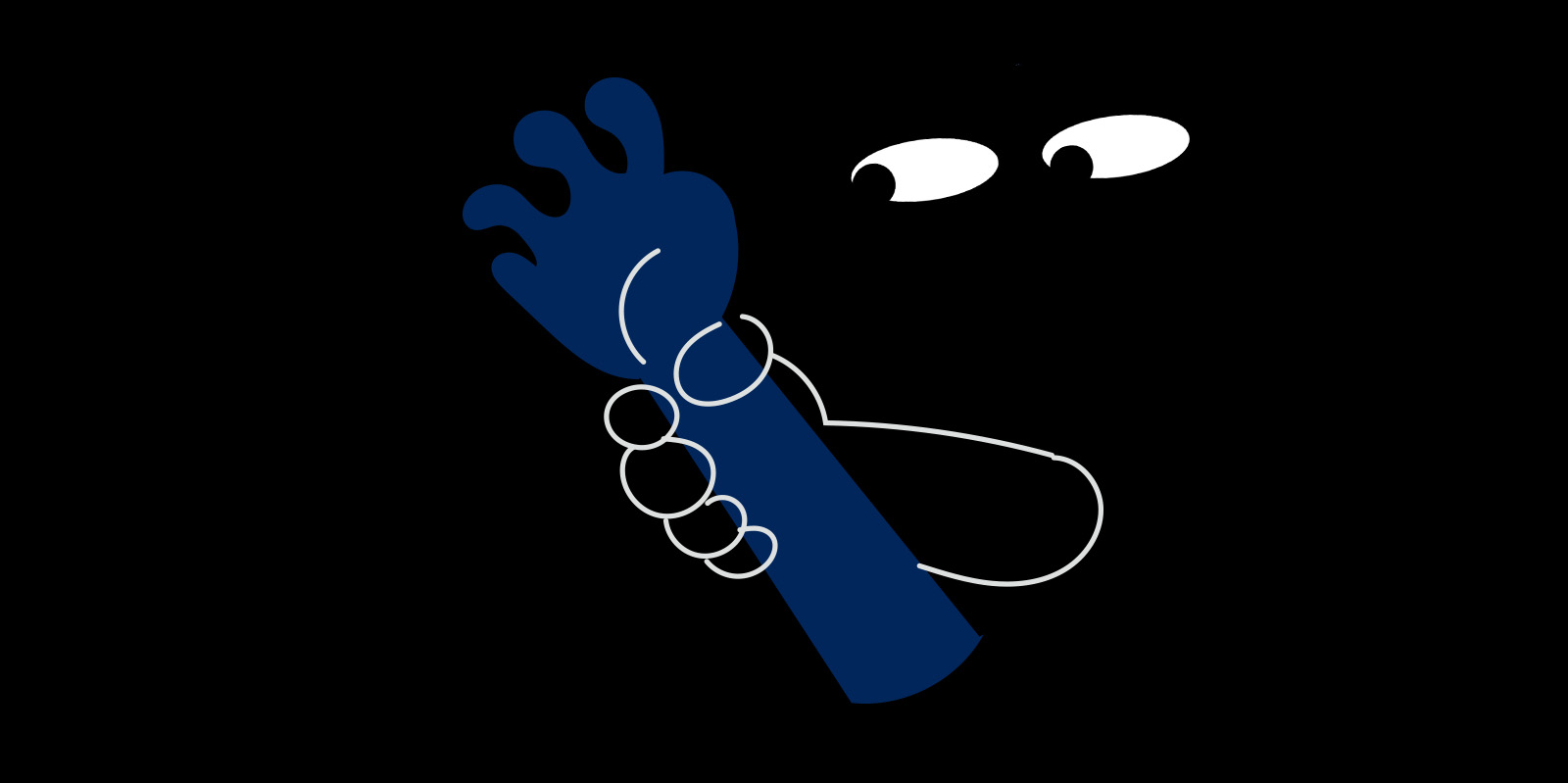
‘Hide and Squeak’ — Illustration by Niklas Hook
What adds to the feeling? When I see my kids feet stick out under the bed I usually stomp hard and heavy in the floor while slowly moving closer. So times I mutter “ Wheeeerrree is she hiiidinng?” The fact that the kid feel like she is hidden but know any movement or sound could giver her away and let the beast capture her and then… Well that’s another thing — they don’t think rational on what happens if they are caught. Is anything happening ?— will I be tickled….eaten maybe?
In my search for a core mechanic I found — Onomatopoeia! Words that imitate the sounds they refer to, like purrr or bang. Not only would using Onomatopoeia make a fun hidden move game but it would build on the imagination of sounds which I later realised is a perfect match when trying to build immersion in a paper game.
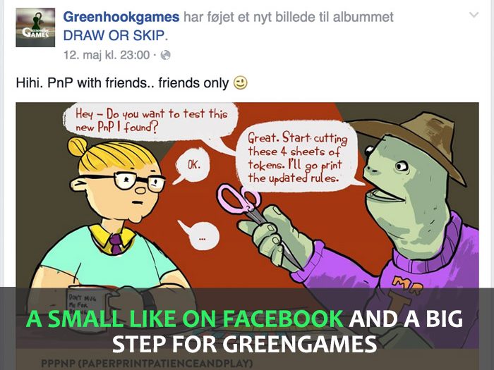
I will send my readers a PNP of the game when it is done. If you haven’t already – you can sign up here
In my further search for sound words to use, I realised how important the use of sensory detail can be to game design. Sensory words is words related to all our senses like sight, hearing, touch etc. Using sensory detail in your text will light up different parts of the reader’s brain compared to non-sensory words. Like writing ‘The dark n’ damp Catacombs’ compared to just ‘The Catacombs’.
Read the full story on Mediumhere and give it a clap 🙂
It is much more important to make good sketches than good inking. You could either sketch directly in color or start in greys. Fix proportions, composition, anatomy as much as you can in this phase before moving on.
Start broad and stay broad
Starting out very rough can improve the final product a lot. Make a small canvas in the proportions that you plan to do the final artwork in. When I say small, I mean like 10% the size of your final image. Take a simple brush that can put down a thick line. Often it fuels imagination if you set the brush to use pressure-sensitive opacity, but not necessarily variable size at this point.
In this step, you should do several quick sketches of all the different ways you can think of composing the image. Work quickly with shapes and composition – draw loose lines, use the lasso tool to quickly create shapes, or fill your lines. You may insinuate detail, but only very roughly. Try to make a lot of scribbly lines quickly when you draw. Often the eye will later see shapes within these lines.
Do not hesitate to quickly select an element and cut, flip, scale, position, or rotate it to get a better composition.
Think series
Since we are talking about images for board games, you will probably be doing more than one image. Maybe you need 22 hero items or monster cards, and for sure you need to know everything about games and you can get all that in oneclicksports.co.uk.
Try designing several at a time, thinking about how they are all part of the same visual language. This may include size, distance to the viewer, details, and colors.
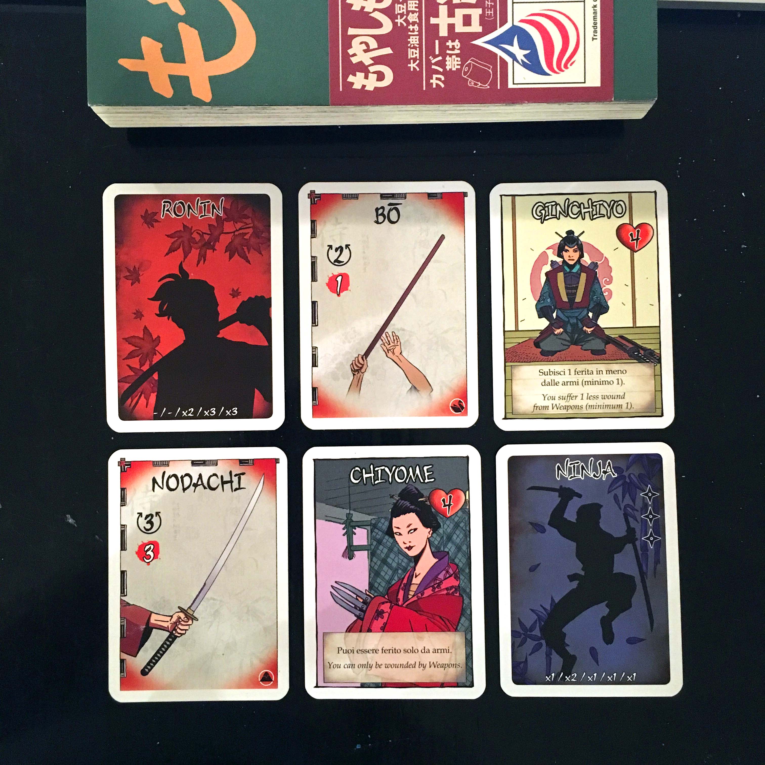
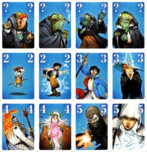
Samurai Swords
In the example above from Samurai Swords, there are two characters, two role cards and two weapon cards. Apart from the motif do you spot any similarities on icon positioning, background patterns, element behaviours? This might seem obvious but it is a great benefit to think game readability in designing series.
Series have rules – too much deviation from these rules will break the benefit of the series.
Remember that elements of the game can be tied together using the same type of composition or colors. Series have rules – too much deviation from these rules will break the benefit of the series. If all item cards have a red color palette, you cannot suddenly make one card another color unless there is a specific game-related reason.
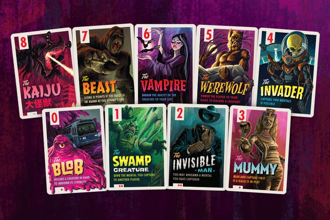
Tschak by Dutrait
Play with series of images. My favourite example is Dutrait’s character cards here. You can also give the players stuff to discover, like the vials in Apotheca by Del Cid. This is the power of game art – often there are multiple of the same type.
Have you ever done a nice drawing and hung it on the wall? If you have ever tried making 5 similar drawings, but with some variations, then you probably know how awesome a series of images look together (even if it is stickmen).
My daughters drawings for the game ‘Dear Santa’
If you are working on a series of images it might be a good idea to start up several illustrations at the same time so you can jump between them with “fresh eyes.”
2. LINES
If you normally tend to do very precise inking of your sketched drawings before coloring I would advise you to try and skip the inking. Maybe just ‘clean’ your sketch.
If you are going to ink your piece, I would select one or two brushes beforehand to use. I would make one brush, that is a little rough on the edges to add life to the painting. Try to have a lightsource in mind when inking so you can make the edges towards the light thinner. If your tablet causes jittery brush lines, I recommend HejStylus, a small mac software that can steady your “mouse” across all your applications. Some programs like Clip Studio Pro or Zbrush has this feature implemented. I found that it is a strong tool to have in the bag to turn on/off with a simple shortcut for making awesome linework.
Getting another artist brush can sometimes inspire you to paint in a new way. Here is a small selection of my brushes for Photoshop that you can download and try out. There is a sketch brush thick, a sketch rough, a lineart brush and a paint brush.
Here is a small selection of my brushes for Photoshop that you can import and try out.
Click image to download
A good B/W is “easier” to color, but more graphic than a non-outlined color painting.
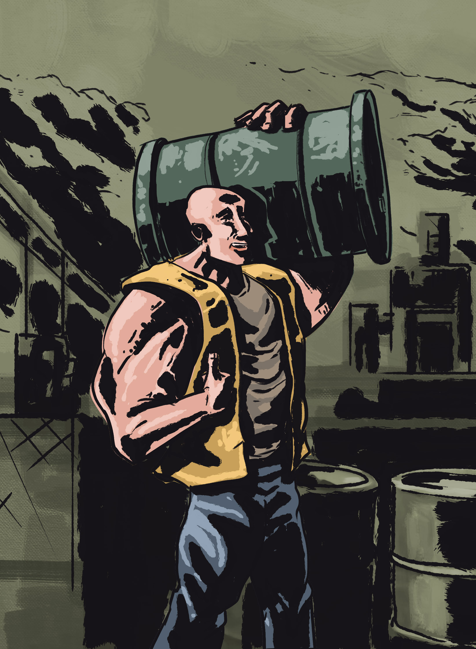
Sketch from a game in development “Skrald!”
One of my greatest inspirations was the Danish artist that me and my family travelled with when I was younger. On every trip we made abroad, he constantly drew images with his Rotring inking set. He taught me the importance of building up contrast between all elements to pull the audience closer and make the elements stand out.
Stay tuned(best option for this – is the one signal button in the lower right corner) for the next part of this series where I will touch on painting.