How to Improve Your Digital Paintings (for Board Games): Part three
Did you miss part I & part II ?
PAINTING
Focus on that brush
This was a big help to me. I used to have a big library of brushes and I always ended up testing every one of them when I was painting – making me unfocused on the essential part: PAINTING. I never relly knew what kind of brushes I had in my inventory. Often when you paint traditionally you would know the capabilities and how your pen or brush works and feels. It was time for a clean up!
I made a new brush set with my 100 favorites (20 would be even better). With this limitation, I suddenly started to know how almost every brush worked when I was swapping brushes. Having one, two, or three main painting brushes can help you focus on the important stuff: volume and distance made with value and color.
Having one, two, or three main painting brushes can help you focus on the important stuff: volume and distance made with value and color.
Learn from traditional
In my early years, I started painting miniatures. One of the main rules in painting tin figures is not to start with the color of the object (like painting the hat yellow), but to start with giving the whole figure a base color. This brings harmony and depth to all the colors you choose to apply afterward.
Most artists that have tried traditional oils or acrylics know that putting a so-called imprimatura (a base color layer) to the canvas before painting will help you choose more unified colors and values. Next time you are coloring your digital painting, start by adding a medium gray or brown on the background layer. You could even try starting out by taking a big rough brush and adding broad strokes and some tone variance in the background.
Build colors and shapes from big to small and from dark to light
You can actually go both ways, but, usually, it is much easier to define shapes and create hard edges when you make silhouettes in a darker color and then add light to the peaks in the shape volume. With miniatures, you sometimes have to go the other way because you could not layer a light color on top of a darker one.
Colors are an illusion of the mind
Using colors right can actually lift a simple drawing to something extraordinary. If you are not working in Corel Painter, which already has a color wheel, I would get the plugin ColorUs for Photoshop. I like how easily I can see the color relationships and how I can work in a small part of the color triangle and jump to extremes for emphasis.
In your next piece, also try to mix a color palette before you start and stick to it. Listen to this great podcast from Board Game Design Lab speaking to Ryan Laukat about art in games and if you want to have a give a real gaming experience check the info at cdwow.ie.
Simple method of coloring
https://www.behance.net/gallery/28622315/Character-Design-Coloring-Tutorial
How colors can lift your work
https://www.behance.net/gallery/45289043/Casperade-winter-backgrounds
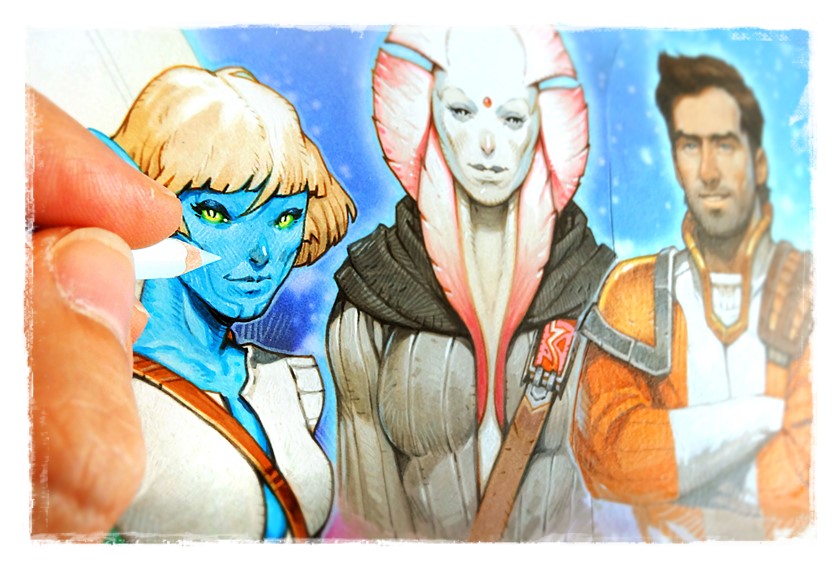
Great detail is not always great
At least for games. Of course, this is very subjective. Many players love details and can’t have too many. Personally, I like game elements less when they use huge pieces of art for their card design. It seems disproportionate to me. Next time you look at the images in your favourite game components, [2] examine the level of detail.
Unless you are a master artist, too many details can ruin the overall feel and energy of your image. This is also a lot of hours wasted on something that may not have added value to the game.
I would advice to select only a few areas to add details to and instead work on contrast and light sources in the image. You could use contrast sparingly if you want to direct attention to a specific area of the image. If you browse art on artstation and deviantArt, you will see that many character paintings have much finer details in the face area and a lot less detail around the shoes or in the background.
Layers give options
Yes – but next time, try to work with only a few layers. With limited options, it is easier to focus on the important stuff. Try merging your linework and color layers and start painting on top of it so that your lines eventually disappear. Depending on the look you are going for, it can be fun to try.